Design System & Tokens for Strata
How I turned Figma into product infrastructure for an enterprise action system.
In Strata, I designed the visual system that supports the product. I created a multi-tier design system in Figma so it could act as a programmable source of truth for engineering, not just a UI library.
Context
Strata is an enterprise platform that unifies operational processes into an Action Center, coordinating tasks and decisions across multiple views. That level of complexity required a design system built for consistency, scale, and implementation speed.
My Role
I led the work from discovery to delivery, collaborating cross-functionally with the CEO, project managers and engineers, and architected the design system in Figma so product, design, and engineering could work from the same foundation.
Before
–UI decisions were made screen by screen, creating drift between design and code.
–Designers and engineers had partially overlapping definitions of components and states.
–Evolving workflows meant redesigning screens instead of reusing stable patterns.
After
✓A multi-tier system of primitives, tokens, components, and templates mapped directly to code.
✓Design and engineering shared the same token and component definitions with clear guidelines.
✓New features reused tested patterns, enabling faster, safer evolution with lower design variance.
Selected Impact
✓Increased delivery velocity by +35% by using the design system as a single visual API.
✓Reduced UI debt and inconsistencies, making product evolution easier without full redesigns.
✓Enabled faster workflow experimentation while maintaining brand and accessibility standards.
Core Design Decisions
I started by defining a primitives layer decoupled from modules so the system had a stable, implementation-ready base.
Color Primitives
Neutral and accent scales optimized for high-density UIs and critical states.
Spacing Primitives
4/8 spacing system applied consistently across layouts, tables, and cards.
Typography Primitives
Heading, subtitle, and body ramps designed for clarity and operational use.
These primitives lived as base variables in Figma and mapped directly to design tokens in code, built on shadcn/ui and Radix UI rather than invented from scratch.
Semantic tokens: from color to intent
I translated primitives into semantic tokens so the system expressed intent, not just appearance.
Colors
primary, neutral, error, warning, success, info.
Typography
primary, muted, critical, on-accent.
States & Feedback
Success, warning, and error states reused across the Action Center, lists, and task details.
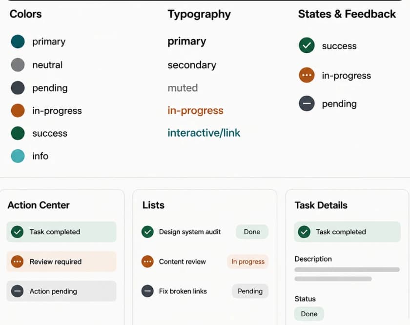
This made theming and branding changes easier without rebuilding components and created a 1:1 mapping from Figma semantic tokens to code tokens. It holds because both sides consume the same semantic tokens. It's a contract, not automation: it breaks the moment engineering re-derives a value instead of consuming the token.
Components for enterprise workflows
I structured components to support multi-role workflows, making the system predictable, scalable, and developer-friendly.
Naming and structure
Components such as Action Item, Task Row, Workflow Step, and Timeline Event were named by their role in the system, not just by appearance.
Auto Layout and slots
Heavy use of Auto Layout with slots for leading/trailing icons, metadata, and AI-generated content to support dynamic data.
Variants and booleans
Action Item used variants for type, priority, and state, plus booleans like has-assignee; Workflow Step used variants for default, current, completed, and exception states.
Figma to code architecture
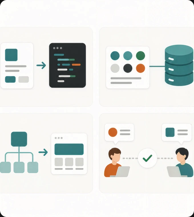
I treated the Figma file as a structured system, with semantically named tokens and components that mapped cleanly to code. Every semantic token had a one-to-one counterpart in the codebase, and once resolved, I delivered the system to engineering as a Storybook the frontend team pulled into its own workflow — Storybook was the versioned reference frontend built from, while Figma stayed the surface where the design was iterated with the client. That pairing was the contract with engineering, not a static spec they translated by hand.
Structured Dataset
Tokens defined in Figma and resolved into Storybook were the single source of truth for visual values.
Mirrored Architecture
Component structure mirrored frontend components and container logic.
Shared Language
Design and engineering worked from the same token and state model, reducing handoff friction and ambiguity.
Ownership and maintenance
Ownership
I was the sole designer on this system and owned it end to end — primitives, semantic tokens, and the contract with engineering. There was no separate governance group, because there was no design team behind me.
Adoption
Figma carried more iteration than Storybook — it's where component states and interactions got negotiated with the client. Storybook was the point of agreement: once a component was settled there, it was the reference the frontend engineer built from. He never changed how a component looked or behaved — what he adapted was the implementation underneath it: naming, the right hook, how it read from the backend, the platform's own constraints. He refined each component in his own frontend-side Storybook, and once that was settled, the platform's components updated from it automatically.
Maintenance
It isn't kept aligned by review — it's kept aligned by the contract itself. Both sides consume the same semantic tokens, and it breaks the moment engineering re-derives a value instead of consuming one.
Risk it removes
Accessibility is checked with measured contrast ratios, not by eye, so WCAG compliance is a property of the tokens rather than a review at the end. With one set of values instead of two, drift between what Figma shows and what ships has nowhere to enter.
AI-native and implementation-ready
I used Claude Code and Figma AI to explore component structures, states, and content variants faster while keeping primitives and semantic tokens stable as the contract with engineering. I delivered the system as implementation-ready projects so tokens, components, and example flows aligned with real product structure instead of staying only in Figma. Because the file was semantically organized, it also became a stronger foundation for future AI-driven guidance, validation, and automation.
Extending token architecture to B2B2C layer.
White-labeled component:
The Strata widget had to work outside the core app shell while still feeling native on client sales pages.
Consistency across surfaces.
I extended the token architecture to adapt to external theming without breaking the internal system of record.
Shared design logic:
The system preserved semantic tokens, component states, and interaction rules across the internal Action Center and the designed customer-facing checkout/tracking layer (prototype, not integrated to production).
Results & Impact
Increased delivery velocity by +35% by using the design system as a single visual API — the same measurement reported in Selected Impact, seen here at the implementation level.
Reduced visual and behavioral inconsistencies across modules.
Created a cleaner handoff because frontend teams consumed the same visual API — defined in Figma, browsed and used through Storybook on the code side.
Built a stronger foundation for future AI-driven features by encoding states and action types semantically.
A design system that ships is a contract:Read the full article on Medium
I write about these decisions in more depth.Design system as code, fixed scope:Check the price on Contra